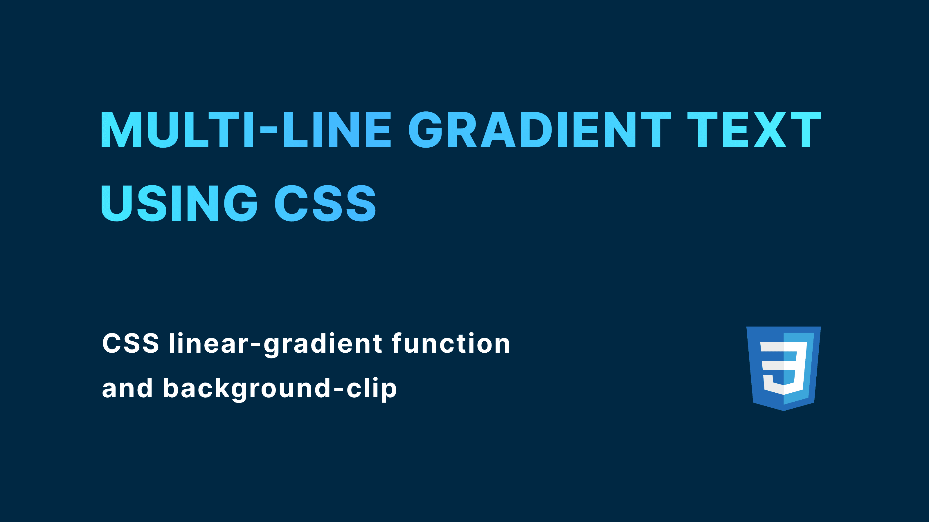
Creating a multi-line gradient text can add a visually striking effect to your website. In this article, I'll show you how to create a multi-line gradient text using CSS.
Step1. Create HTML
The first step is to create the HTML markup for the text. You can simply place
your text and wrap in a span element.
In this example, I'm gonna use a long text as a demonstration that it works with multi-line text.
<p>
  <span>
    This is a multi-line gradient text using CSS linear-gradient and
    background-clip.
  </span>
</p>
Step2. Add styling
Next, we will apply the styling. I'll show you the finished code first, then I'll explain step by step.
p span {
  display: inline-block;
  background-image: linear-gradient(135deg, #43b8ff, #4ef8ff);
  -webkit-background-clip: text;
  color: transparent;
}
If you apply the styling above, you'll get something like this:
As you can see, the text has a gradient color and it is applied to each line of text. Now that we've seen what we are gonna create, I'll explain line by line.
2-1. Add gradient effect in the background
Firstly, we are gonna apply gradient effect in the background, using CSS linear-gradient function.
/* background-image: linear-gradient(degree, color-1, color-2); */

span {
  background-image: linear-gradient(135deg, #43b8ff, #4ef8ff);
}
In this code, I only set 2 colors but you can put as many colors as you want.
At this point, the output text looks like this.
2-2. Clip the backgorund with text
Secondly, we are gonna clip the background with its text shape. You can do so by using background-clip property.
span {
  background-image: linear-gradient(135deg, #43b8ff, #4ef8ff);
  -webkit-background-clip: text;
}Now the background is clipped to its text shape, but we don't see the gradient anymore because the inherited text color is overlapping the gradient.
To make it visible, we need to add one more line.
span {
  background-image: linear-gradient(135deg, #43b8ff, #4ef8ff);
  -webkit-background-clip: text;
  color: transparent;
}By making the text color transparent, we can finally see the gradient color.
2-3. Choose a display property
Depending on the text length and display property, the gradient color behaves differently. I'll explain this using the demo I prepared.
display: inline
Let's first see how it behaves when the display property is set to inline.
p span {
  display: inline;
  background-image: linear-gradient(90deg, #12c2e9, #c471ed, #f64f59);
  -webkit-background-clip: text;
  color: transparent;
}
You can click on "Toggle clip" to see the text content.
As you can see, the width of inline element depends on its length of text inside, and gradient color takes up as much width as it has. This might sound nothing special, but you will see the different results with other display values.
display: block
Now let's see how it works with block-level elements.
p span {
  display: block;
  background-image: linear-gradient(90deg, #12c2e9, #c471ed, #f64f59);
  -webkit-background-clip: text;
  color: transparent;
}
A block-level element always takes up the full width (if not specified), regardless of the length of the text.
The text is short, but the gradient color fills the entire width of the block. This ends up making the only small part of gradient color visible when it's clipped.
When the text is long enough to occupy the entire width, the whole gradient color becomes visible even when it's clipped.
display: inline-block
Finally, we'll see how it works with inline-block element. inline-block elements have both characteristics of inline and block elements.
While there are a lot to explain how inline-block works, I'm going to focus solely on how the gradient color behaves.
When the text is short, it behaves like an inline element.
When the text is long and takes up the full width, it behaves like a block element.
I personally prefer using this because it is flexible in terms of the length of the text. You can show the whole gradient color no matter how long the text would be.
Conclusion
That's it! I have explained how to create multi-line gradient text using CSS, and how it behaves differently depending on display values.
You can choose the display value that most suits your project by comparing each one in the following demos.