Having a dark mode is a common feature for modern websites. It would be great for user experience to have an option to toggle between light / dark mode depending on user's preference.
In this article, I'll show you how to implement a dark mode in your Next.js apps.
Prerequisite
- You use Next.js for your site or app
You use CSS Variables for managing colors
What we build
These are the features of what we are gonna build.
- The user can toggle to switch between Light and Dark mode.
- The user's system settings will be applied for their first visit.
The prefered theme setting will be preserved in
localStoragefor their next visit.
If this is what you want, follow along this tutorial.
Step 1. Install next-themes package
We need only 1 package for implementing Dark mode.
Open the terminal and install next-themes package.
$ npm install next-themes
# or
$ yarn add next-themes
Step 2. Create a CSS file for managing colors
Now, we need to create a CSS file to store all the colors in Light / Dark mode. Create /styles/colors.css file and set your colors like this:
:root {
  /* Your default theme */
  --background: white;
  --foreground: black;
}

[data-theme="dark"] {
  --background: black;
  --foreground: white;
}
The root pseudo-class selects the root element which is html tag. The variables in this scope will be applied to Light mode.
And as you can guess, [data-theme='dark'] will be applied to Dark mode. This data-theme attribute is added and updated whenever the user toggles the theme.
Step 3. Use CSS variables in your .css files
Skip this section if you already know how to use CSS variables.
Previously we created a colors.css and configured colors for Light / Dark mode. Now, we need to apply those CSS variables in the stylesheets.
Here's an exapmle of how you write CSS variables.
body {
  background-color: var(--background);
  color: var(--foreground);
}
Like the example code above, replace all the hard-coded colors with CSS variables.
Step 4. add ThemeProvider in _app.js
To enable dark mode, we need to do 2 things in _app.js file which are the following:
- Wrap the whole app with
ThemeProvider - Import
colors.css
import "@/styles/colors.css";
import { ThemeProvider } from "next-themes";

export default function App({ Component, pageProps }) {
  return (
    <ThemeProvider>
      <Component {...pageProps} />
    </ThemeProvider>
  );
}
That's it! Now your Next.js app supports dark mode.
If you refresh the page, you'll see data-theme attribute on html tag. The value would be either light or dark depending on your system settings.
Step 5. create Theme Switch component
Now that we've implemented a dark mode, let's create a component to toggle between light and dark mode.
Create /components/theme-switch.jsx file and paste the code below:
import { useState, useEffect } from "react";
import { useTheme } from "next-themes";

export default function ThemeSwitch() {
  const [mounted, setMounted] = useState(false);
  const { resolvedTheme, setTheme } = useTheme();

  // useEffect only runs on the client, so now we can safely show the UI
  useEffect(() => {
    setMounted(true);
  }, []);
  if (!mounted) {
    return null;
  }

  return (
    <>
      <p>Current theme: {resolvedTheme}</p>
      <button
        onClick={() => setTheme(resolvedTheme === "light" ? "dark" : "light")}
      >
        <span>Toggle Theme</span>
      </button>
    </>
  );
}
I prepared the live demo of this code. You can try it out by clicking the "Toggle Theme" button.
Every time you click on the button, the value of data-theme attribute on html element will be switched.
Code explanation
First of all, we need to write a code to avoid hydration mismatch error.
useEffect(() => {
  setMounted(true);
}, []);
if (!mounted) {
  return null;
}

return {
  /* component here */
};
This is officially recommended way so if you wanna know more about it, please check out the next-themes GitHub page.
setTheme
To set the theme, we use setTheme function prepared by next-themes.
// Set [data-theme="light"]
<button onClick={() => setTheme("light")}>
You can simply pass the theme name as a string, and it will set it to data-theme attribute of the root element.
Since we wanna toggle the themes, we can write like this:
<button
  onClick={() => setTheme(resolvedTheme === "light" ? "dark" : "light")}
>
If the current theme is light, switch it to dark, otherwise set is as light.
resolvedTheme
next-themes provides theme and resolvedTheme that return the active theme name.
These two behave almost the same but the difference is whether it supports system theme or not.
console.log("theme: ", theme);
console.log("resolvedTheme:", resolvedTheme);
I changed my Mac OS setting to 'dark' and this is the result:
theme understands that the current theme is system, but it doesn't know whether the system setting is light or dark.
So if you want to support the system setting, use resolvedTheme.
Testing
Now, let's see if the code is working. When you visit the site for the first time, next-themes stores the active theme value in localStorage.
To see this, open your developer tool in your browser (In my case, I use Google Chrome). Click on [Application] tab and choose [Local Storage] from the left menu bar.
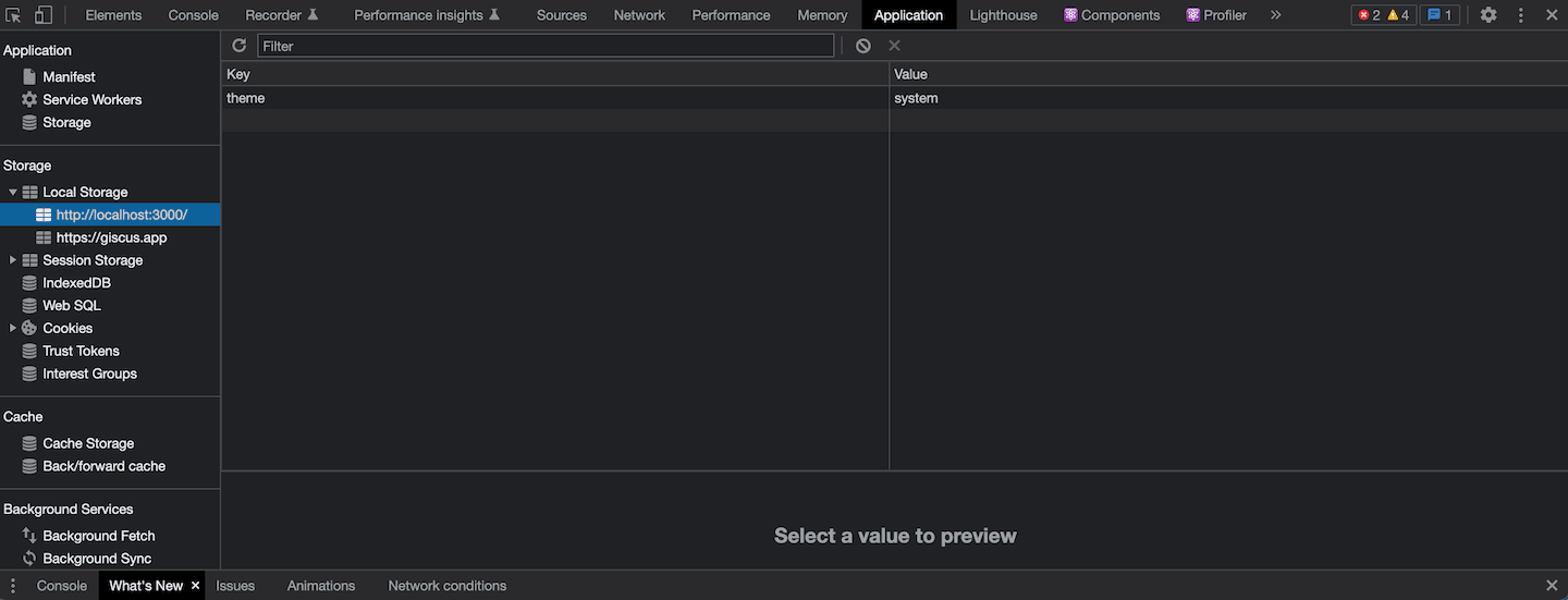
For the first visitor, theme:system is stored in here. Try checking if the system setting is reflected by switching the appearance mode.
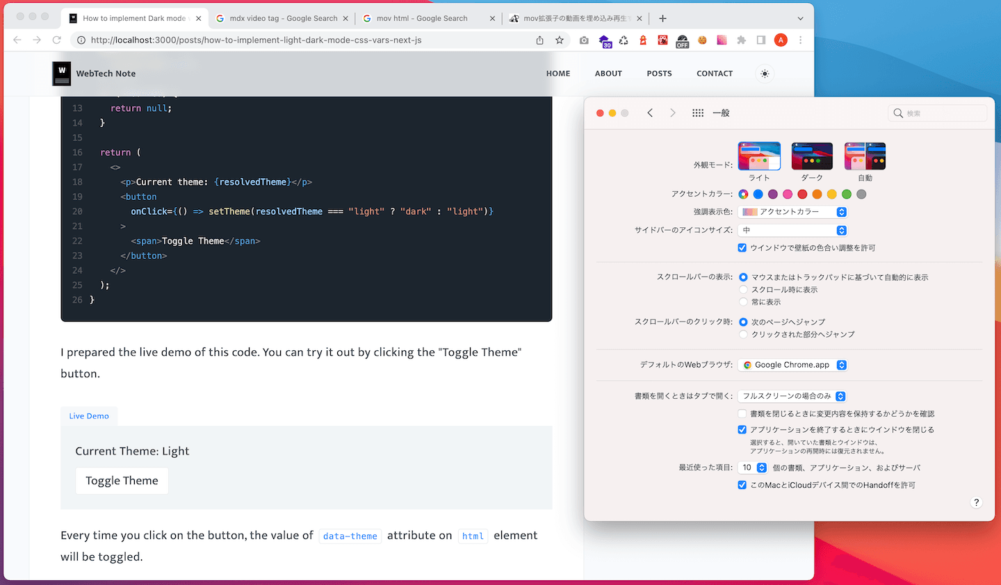
System Settings > Appearance: Light
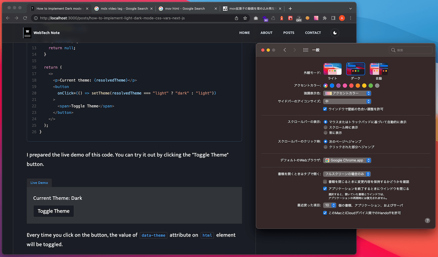
System Settings > Appearance: Dark
If the visitor clicks on the toggle button, theme value will be updated and stored in the storage.
You can check it yourself by clicking the button below:
That's it! Now your website supports the system theme, and is capable of switching between Light / Dark mode.
In this article, I showed you the most basic example. If you wanna know more about next-themes, please check out their official page.